


Orya is an app for psoriasis patients which lets you track your symptoms for you to gain insights on your disease.
The app was created during my time as »Graphic Designer Mobile Apps« at Temedica in cooperation with Bristol Myers Squibb.
I was solely responsible for the branding process taking the role of a Visual Designer and Art Director.

Thanks to the insights we gained from previous projects on chronic diseases and from working closely with our (future) users we were already aware how sensitive they felt about their condition.
It was crucial for us to implement these sensitivities into the way I approached the design and the reason why every step of the branding process was tested by our UX Researcher. I suggested several colour palettes as seen above and also checked with users if the playful illustration style would be appreciated. The test results showed that they preferred a colour scheme which did not remind them of their skin like cool green or blue tones. The users liked the general design ideas as well as the personal yet respectful tone of voice. We, however, decided to add a second more realistic illustration style for specific use cases.
Meanwhile, I was working very closely with our UX Designer to make sure the brand could be easily integrated into the existing prototypes and if these prototypes would be going into the direction I had in mind.
Especially with this project accessibility was a very important topic for me. I made sure all brand elements were accessible e.g. testing every shade of every colour to see if it had the right contrast value and marking in the brand guideline whether to write light or dark text on it for best legibility.

The design concept of the branding is based on the six types of psoriasis.
Every type was assigned a corresponding shape which is used as base for logos, illustrations, background elements etc.

The different shapes give Orya the option of a variable logo system with the circle of the psoriasis vulgaris as the main logo.
For certain occasions e.g. an event for only one specific type of psoriasis, the logo can be switched out without being less recognizable as the typeface stays the same.


For marketing and social media I created a set of illustrations based on the shapes:
The Orya characters were born.
The Orya characters were born.

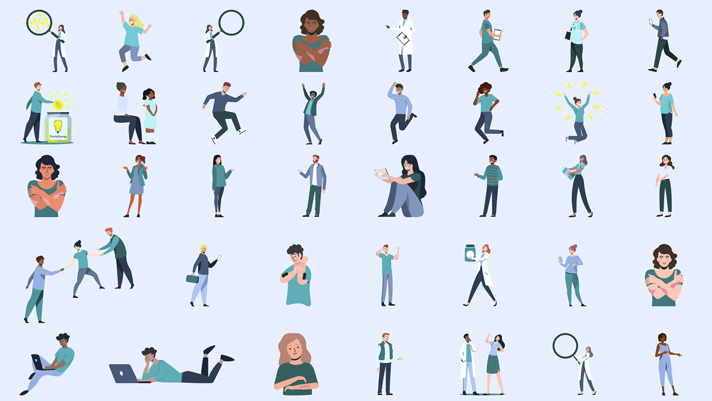
The characters were then complemented by several adapted stock illustrations of people and objects.

For the app release I designed a landing page, app store creatives and many Google and Meta ads (static and in motion).
I also created Canva templates for social media and a powerpoint master.
As you can see in the Instagram feed below the concept of the different shapes as backgrounds, buttons and in illustrations is always present.

Orya went live in 2022 but sadly was cut due funding a year later.


